
Most Shopify merchants set up checkout once and never touch it again. The homepage gets redesigned, product pages get A/B tested, but checkout just sits there.
The average online store cart abandonment rate is 70% based on 50 studies.
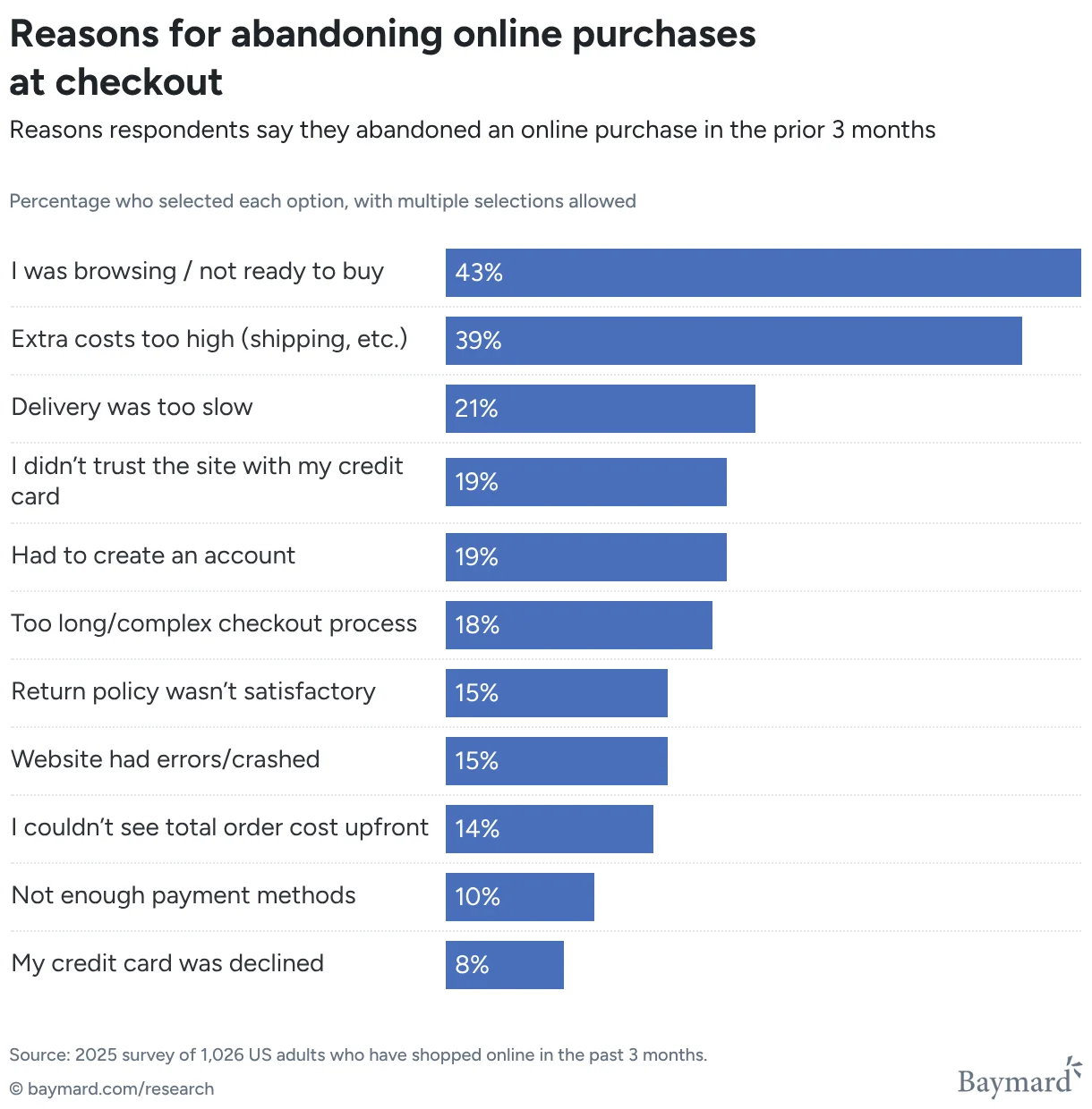
Source: Baymard Institute
Checkout is the most important page on your store. It is where the real conversion happens and most stores are leaving it broken in ways that are completely fixable.
Here are 23 real mistakes, ordered by impact, and how to fix each one.
1. Shipping cost revealed only at the payment step
Extra costs are the single biggest abandonment driver: 39% of shoppers leave because of them, more than any other checkout point.
Fix: Show a shipping estimate right after the address step, not at payment.
2. No free shipping bar
Customers won’t know they’re $8 away from free shipping unless you tell them.
Fix: Show a progress bar at checkout that updates in real time as the cart value changes.
3. Delivery estimates are too slow (or missing)
21% of shoppers abandon because delivery is too slow, the second-highest reason after cost.
Fix: Show accurate, realistic delivery estimates at checkout, and surface faster shipping options where you actually offer them.
4. Guest checkout is not the default
Forcing account creation mid-purchase costs 19% of shoppers.
Fix: Go to Settings → Checkout → Customer contact method, and keep “Require customers to sign in to their account before checkout” unchecked.
5. Checkout takes too many steps
18% of shoppers abandon a checkout that feels too long or complicated.
Fix: Cut checkout down to only the fields you actually need to fulfil the order. Combine steps and remove duplicate fields.
6. No trust badges at checkout
Customers have their card out. A checkout with no security or guarantee icons gives them a reason to pause and leave.
Fix: Add trust badges near the payment section that match your guarantees: free returns, secure checkout, authentic products.
7. No testimonials at checkout
By the payment step, all the social proof from your product pages is gone, and customers are deciding with no reassurance.
Fix: Add one or two short testimonials near the payment section confirming they made the right choice.
8. No payment icons
If customers don’t see their preferred method (PayPal, Klarna, Apple Pay) before payment, they assume it isn’t available and drop off.
Fix: Show payment icons earlier in the checkout flow, not just at payment.
9. Showing irrelevant payment methods
“Pay in installments” on a $12 order looks odd. Cash-on-delivery for an unserved country causes confusion.
Fix: Use payment rules to hide or reorder methods by cart value, location, or product type.
10. No control over shipping methods
Showing next-day delivery you can’t fulfill, or options for regions you don’t serve, creates order problems and bad reviews.
Fix: Use shipping rules to show only accurate delivery options for the cart and customer location.
11. Checkout branding doesn’t match your store
A beautifully designed store followed by a mismatched checkout breaks the trust.
Fix: Customise your checkout to match your brand: logo, colours, button styles, fonts, etc. Shopify separates published and unpublished checkout profiles, so edit the unpublished one first, then apply it when ready.
12. No way to edit the cart from checkout
A customer who wants to change a quantity or variant has no way to do it without leaving checkout, breaking their flow.
Fix: Add cart line item controls at checkout so customers can adjust quantities, variants, or products without leaving.
13. No way for customers to reach you
A customer with a quick question (wrong size, delivery date, payment issue) has no chat or contact link, so they close the tab.
Fix: Add contact buttons (WhatsApp, email, or support link) so customers get a fast answer without leaving checkout.
14. No address validation
Typos, missing apartment numbers, and wrong zip codes cause failed deliveries and avoidable re-shipping costs.
Fix: Validate addresses at checkout before the order is placed and prompt customers to fix any issues.
15. No confirmation that a discount or promotion applied
Customers who enter a discount code can’t always tell if it worked, so they abandon it to go double-check.
Fix: Show a clear confirmation banner when a discount or promotion is applied.
16. No visible policy link at checkout
Customers unsure about your return or shipping policy hesitate at payment, and most won’t dig through your footer.
Fix: Add a clear policy link near the payment section so customers can check before they commit.
17. No FAQ section at checkout
Last-minute questions about returns or delivery times send customers to Google, and some don’t come back.
Fix: Add a collapsed FAQ block at checkout with 3–5 answers to your most common questions.
18. No VAT number field for B2B buyers
EU and UK business buyers need a VAT number for their records; without a field, they can’t complete the order or must contact you manually.
Fix: Add an optional VAT number field at checkout to remove this blocker for B2B customers.
19. No gift note, order note, or delivery instructions fields
Gift buyers can’t add a message, customers with allergy or delivery notes have to contact support, and tricky courier access has nowhere to leave instructions.
Fix: Add optional gift note, order note, and delivery instructions fields. Minutes to set up, and each removes friction for a specific segment of buyers.
20. Poor mobile checkout layout
Most checkout sessions happen on mobile, and cramped fields, tiny buttons, or misaligned steps push customers to give up.
Fix: Optimise spacing, tap targets, and content hierarchy specifically for mobile checkout.
21. Slow checkout load times
Every extra second of load time costs conversions, customers already have their card out and won’t wait.
Fix: Keep checkout lightweight. Avoid heavy scripts and unnecessary apps that slow down the page.
22. Irrelevant upsells
Generic upsells that don’t match the cart or customer feel like interruptions, not helpful suggestions.
Fix: Only show upsells that logically match the cart contents or customer segment.
23. No personalisation
Treating every customer the same wastes an opportunity to tailor content by cart, segment, or market.
Fix: Personalise checkout content, banners, or offers based on cart value, customer segment, or market.
The pattern here
Every mistake on this list is the same problem in a different costume: a checkout that was set up once and never touched again.
The good news is that none of these require a developer or a theme rebuild. Shopify’s checkout extensibility lets you add all of this (trust badges, gift notes, banners, VAT fields, everything) without touching code. If your checkout is missing even a handful of these, fixing them is worth doing before you spend another dollar on ads.
If you want to handle all of it from one place, Checkout Extender: All in 1 covers every item on this list.